
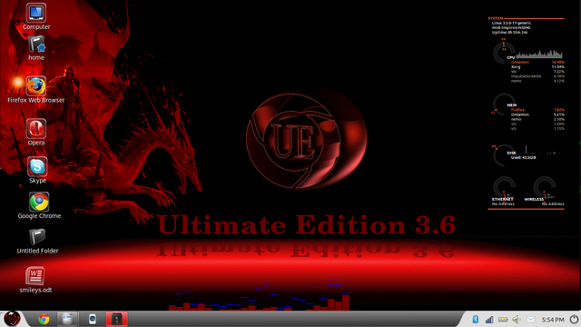
 . i want to give the menu and calender areas a solid colour and make the area in between slightly transparent with curved sides like in the picture
This is the cinnamon.css
- Code: Select all
/* ###################################################################
 * Section common with Gnome Shell
 * ... contains a few cinnamon specific styles (rare occurences)
 * Tout was begun using Baldr as template, over half of which remains.
 * ###################################################################*/
stage {
font-family: sans, sans-serif;
font-weight: normal;
}

.cinnamon-link {
color: #0000ff;
text-decoration: underline;
}

.cinnamon-link:hover {
color: #0000e0;
}

StScrollBar {
padding: 0px;
}

StScrollView.vfade {
-st-vfade-offset: 68px;
}

StScrollView StScrollBar {
min-width: 13px;
min-height: 26px;
}

StScrollBar StBin#trough {
        border: 1px solid rgba(0,0,0,0.3);
   border-radius: 0px;
    background-gradient-direction: horizontal;
    background-gradient-start: #f0f0f0;
    background-gradient-end: #f7f7f7;
}

StScrollBar StButton#vhandle,
StScrollBar StButton#vhandle:hover {
    background-image: url("scroll-vhandle.png");
    border-image: url("scrollv.svg") 9 9 9 9;

}

StScrollBar StButton#hhandle,
StScrollBar StButton#hhandle:hover {
    background-image: url("scroll-hhandle.png");
    border-image: url("scrollh.svg") 9 9 9 9;
}

StTooltip StLabel {
    border-radius: 2px;
    padding: 2px 12px;
    background-color: rgba(0,0,0,0.60);
    box-shadow: 0px 0px 4px 2px rgba(0,0,0,0.5);
    color: #fff;
    font-size: 8.5pt;
    font-weight: normal;
    text-align: center;
}

#Tooltip {
    border-radius: 2px;
    padding: 2px 12px;
    background-color: rgba(0,0,0,0.60);
    box-shadow: 0px 0px 4px 2px rgba(0,0,0,0.5);
    color: #fff;
    font-size: 8.5pt;
    font-weight: normal;
    text-align: center;
}

/* ===================================================================
 * Shared button properties
 * ===================================================================*/

.notification-button, .notification-icon-button,
.hotplug-notification-item, .hotplug-resident-eject-button,
.modal-dialog-button {
    color: #444;
    border: 1px solid rgba(120,120,120,0.7);
    background-gradient-direction: vertical;
    background-gradient-start: #f7f7f7;
    background-gradient-end: #ccc;
    box-shadow: 0px 0px 3px 1px rgba(0,0,0,0.1);
}

.notification-button:hover,
.notification-icon-button:hover, .hotplug-notification-item:hover,
.hotplug-resident-eject-button:hover, .modal-dialog-button:hover {
}

.notification-button:focus,
.notification-icon-button:focus, .hotplug-notification-item:focus,
.modal-dialog-button:focus {
    border: 1px solid #555;
}

.notification-button:active, .notification-icon-button:active,
.hotplug-notification-item:active, .hotplug-resident-eject-button:active,
.modal-dialog-button:active, .modal-dialog-button:pressed {
        border: 1px solid #eee;
   border-radius: 3px;
        box-shadow: inset 0px 0px 1px 1px rgba(0,0,0,0.50);
}

/* ===================================================================
 * PopupMenu (popupMenu.js)
 * ===================================================================*/

.popup-menu-boxpointer {
}

.popup-menu {
    border-radius: 6px;

  background-gradient-direction: vertical;
    background-gradient-start: #fff;
    background-gradient-end: #ccc;
    box-shadow: 0px 0px 5px 3px rgba(0,0,0,0.35);
    padding-left: 2px;
    padding-right: 2px;
    border: 1px solid rgba(120,120,120,0.7);
    color: #2c2c2c;
    font-size: 9pt;

}

.popup-sub-menu .popup-menu-item:ltr {
   padding-right: 0em;
}
.popup-sub-menu .popup-menu-item:rtl {
   padding-left: 0em;
}

.popup-sub-menu StScrollBar {
    padding: 4px;
}

.popup-sub-menu StScrollBar StBin#trough {
    border-width: 0px;
}

.popup-sub-menu StScrollBar StBin#vhandle {
    background-color: #444;
    border-width: 0px;
}

.popup-combo-menu {
}

.popup-menu-content {
    padding: 0.5em 0em;
}

.popup-menu-item {
    padding: .4em 1.75em;
    spacing: 1em;
    transition-duration: 100;
}

.popup-menu-item:active {
    border: 1px;
    text-shadow: #fff 0px 1px 3px;
    color: #456d19;
    border-right: 0px;
    border-left: 0px;
    padding-top: 4px;
    padding-bottom: 4px;
}

.popup-menu-item:insensitive {
    color: #888;
}

.popup-image-menu-item {
}

.popup-combobox-item {
    spacing: 1em;
}

.popup-separator-menu-item {
    background-color: #787878;
    border: 1px solid rgba(255,255,255,0.9);
    border-left: 0px;
    border-right: 0px;
    border-top: 0px;
    height: 0.1em;
}

.popup-alternating-menu-item:alternate {
    font-weight: bold;
}

.popup-slider-menu-item {
    color: #ddd;
    height: 0.3em;
    min-width: 15em;
    background-color: #444;
    border-radius: 2px;
    border: 1px solid #2c2c2c;
    box-shadow: 0px 1px 4px 1px rgba(255,255,255,0.2);
    -slider-border-width: 1px;
    -slider-handle-radius: 1em;
    -slider-height: 0.3em;
    -slider-border-color: rgba(0,0,0,0);
}

.popup-device-menu-item {
    spacing: .5em;
}

.popup-inactive-menu-item {
    font-weight: normal;
    color: #2c2c2c;
}

.popup-subtitle-menu-item {
    font-weight: bold;
}

.popup-menu-icon {
    icon-size: 1.14em;
}

/* Switches (to be used in menus) */
.toggle-switch {
    width: 41px;
    height: 20px;
}

.toggle-switch-us,
.toggle-switch-intl {
    background-image: url("toggle-off.png");
}

.toggle-switch-us:checked,
.toggle-switch-intl:checked {
    background-image: url("toggle-on.png");
}

.nm-menu-item-icons {
    spacing: .5em;
}

/* ===================================================================
 * Panel (panel.js)
 * ===================================================================*/

#panel {

    background-gradient-direction: vertical;
    background-gradient-start: #fff;
    background-gradient-end: #999;
    box-shadow: 0px 0px 1px 1px rgba(0,0,0,0.35);
    height: 25px;
    padding-left: 3px;
}

#panelLeft, #panelCenter, #panelRight {
    spacing: 0px;
}

#panelLeft:ltr {
    padding-right: 1px;
    padding-left: 1px;
}
#panelLeft:rtl {
   padding-left: 4px;
}
#panelRight:ltr {
   padding-left: 0px;
   spacing: 0px;
}
#panelRight:rtl {
   padding-right: 0px;
   spacing: 0px;
}

.panel-status-button,
.panel-button {
    -natural-hpadding: 5px;
    -minimum-hpadding: 5px;
    font-size: 9pt;
    font-weight: bold;
    text-shadow: #eee 0px 1px 1px;
    color: #2c2c2c;
    transition-duration: 150;
    border: 1px solid transparent;
    icon-size: 16px;
}

.panel-status-button:hover,
.panel-button:hover {
        border: 1px solid #eee;
   border-radius: 3px;
        box-shadow: inset 0px 0px 3px 1px rgba(0,0,0,0.6);
}

.panel-menu {
    -boxpointer-gap: 0px
}

.system-status-icon {
    icon-size: 1.14em;
}

#panelLeft:dnd {
        border: 1px solid #ff0000;
}
#panelCenter:dnd {
        border: 1px solid #00ff00;
}
#panelRight:dnd {
        border: 1px solid #0000ff;
}

/* ===================================================================
* Overview
* ===================================================================*/

#overview {
spacing: 12px;
background: rgba(0,0,0,0.4);
}

.expo-background {
spacing: 12px;
background: rgba(0,0,0,0.4);
}

.window-caption {
padding: 4px 8px;
color: #eee;
spacing: 25px;
font-weight: bold;
transition-duration: 200;
box-shadow: 0px 2px 4px rgba(0,0,0,0.7);
-cinnamon-caption-spacing: 4px;
}

.window-caption#selected {
}

.window-close,
.workspace-close-button {
background-image: url("overview-window-close.png");
height: 22px;
width: 22px;
-st-background-image-shadow: 0px 2px 4px rgba(0,0,0,0.7);
-cinnamon-close-overlap: 12px;
transition-duration: 200;
}

.window-close:hover,
.workspace-close-button:hover {
background-image: url("overview-window-close-hover.png");
}

.workspace-thumbnails {
spacing: 14px;
}

.workspace-add-button {
background-image: url("workspace-add-button.png");
height: 32px;
width: 32px;
-st-background-image-shadow: 0px 2px 4px rgba(0,0,0,0.7);
}

.window-close-area {
background-image: url("trashbox.svg");
background-color: transparent;
height: 120px;
width: 222px;
}

.ripple-box {
width: 104px;
height: 104px;
background-image: url("corner-ripple.png");
}

/* ===================================================================
* Looking Glass
* ===================================================================*/

#LookingGlassDialog {
background: rgba(0,0,0,0.85);
spacing: 4px;
padding: 4px;
border-radius: 2px;
border: 1px solid #161616;
color: #00c400;
box-shadow: 0px 1px 4px 2px rgba(0,0,0,0.5);
}

#LookingGlassDialog > #Toolbar {
border: 1px solid #00c400;
border-top: 0px;
border-left: 0px;
border-right: 0px;
padding-bottom: 4px;
}

#LookingGlassDialog .labels {
spacing: 4px;
}

#LookingGlassDialog .notebook-tab {
padding: 1px 8px;
color: #00c400;
}

#LookingGlassDialog .notebook-tab:hover {
color: #00ff00;
}

#LookingGlassDialog .notebook-tab:selected {
background: #00c400;
border-radius: 2px;
color: #000;
}

#LookingGlassDialog .lg-inspector-title {
font-weight: bold;
padding-bottom: 8px;
}

.lg-dialog StLabel {
color: #00ff00;
}

.lg-dialog StEntry {
color: #00ff00;
}

.lg-obj-inspector-title {
spacing: 4px;
}

.lg-obj-inspector-button {
background: rgba(153,204,0,0.2);
border: 1px solid rgba(153,204,0,0.5);
height: 14px;
padding: 0 8px;
border-radius: 1px;
color: rgba(153,204,0,1.0);
}

.lg-obj-inspector-button:hover {
background: rgba(153,204,0,1.0);
border: 1px solid rgba(153,204,0,1.0);
color: #000;
}

.lg-dialog .cinnamon-link {
color: #00ff00;
}

.lg-dialog .cinnamon-link:hover {
color: #0000ff;
}

#LookingGlassDialog StBoxLayout#EvalBox {
padding: 4px;
spacing: 4px;
}

#LookingGlassDialog StBoxLayout#ResultsArea {
spacing: 4px;
}

#lookingGlassExtensions {
padding: 4px;
}

.lg-extension-list {
padding: 4px;
spacing: 6px;
}

.lg-extension {
border: 1px solid #333;
border-top: 0px;
border-left: 0px;
border-right: 0px;
padding: 4px 0px;
}

.lg-extension-name {
font-weight: bold;
}

.lg-extension-meta {
spacing: 6px;
}

#LookingGlassPropertyInspector {
background: rgba(0, 0, 0, 0.7);
border-radius: 3px;
border: 1px solid #333;
padding: 6px;
color: #00ff00;
}

/* ===================================================================
 * Date applet
 * ===================================================================*/

.calendar {
    padding: .4em 1.75em;
    spacing-rows: 0px;
    spacing-columns: 0px;
}

.calendar-month-label {
    color: #2c2c2c;
    font-size: 9pt;
    padding-bottom: 3px;
    padding-top: 2px;
    font-weight: bold;
}

.calendar-change-month-back {
    width: 16px;
    height: 16px;
    background-image: url("calendar-left.png");
    border-radius: 2px;
}

.calendar-change-month-back:rtl {
    background-image: url("calendar-right.png");
}

.calendar-change-month-forward {
    width: 16px;
    height: 16px;
    background-image: url("calendar-right.png");
    border-radius: 2px;
}

.calendar-change-month-forward:rtl {
    background-image: url("calendar-left.png");
}

.datemenu-date-label {
    padding: .4em 1.75em;
    font-size: 9pt;
    color: #444;
    font-weight: bold;
    text-align: center;
}

.calendar-day-base {
    font-size: 7.5pt;
    text-align: center;
    width: 2.4em;
    max-height: 2.4em;
    padding: 5px 0px 5px 0px;
}

.calendar-day-base:active {
    background-color: #2c2c2c;
}

.calendar-day-heading {
    color: #2c2c2c;
    font-weight: bold;
    padding-top: 1em;
}

.calendar-week-number {
    padding-left: 0px;
    color: #2c2c2c;
    font-weight: bold;
}

/* Hack used in lieu of border-collapse - see calendar.js */
.calendar-day {
    border: 1px solid #000;
    color: #2c2c2c;
    border-top-width: 0;
    border-left-width: 0;
}
.calendar-day-top {
    border-top-width: 1px;
}
.calendar-day-left {
    border-left-width: 1px;
}

.calendar-work-day {
}

.calendar-nonwork-day {
}

.calendar-today {
    color: #fff
}

.calendar-other-month-day {
    color: #888;
}

.calendar-day-with-events {
    font-weight: bold;
    color: #2c2c2c;
}

/* ===================================================================
* Notifications
* ===================================================================*/

#notification {
    font-size: 9pt;
    font-weight: bold;
    border-radius: 2px;
    background-color: rgba(0,0,0,0.60);
    box-shadow: 0px 0px 4px 2px rgba(0,0,0,0.5);
    padding: 8px 8px 8px 8px;
    spacing-rows: 10px;
    spacing-columns: 10px;
    margin-from-right-edge-of-screen: 4px;
    margin-from-top-edge-of-screen: 40px;
    width: 30em;
    color: #fff;
}

#notification.multi-line-notification {
    padding-bottom: 8px;
    color: #fff;
}

/* We use row-span = 2 for the image cell, which prevents its height preferences to be
taken into account during allocation, so its height ends up being limited by the height
of the content in the other rows. To avoid showing a stretched image, we set the minimum
height of the table to be ICON_SIZE + IMAGE_SIZE + spacing-rows = 24 + 125 + 10 = 159 */

.notification-with-image {
min-height: 159px;
color: white;
}

#notification-scrollview {
max-height: 10em;
}
#notification-scrollview > .top-shadow, #notification-scrollview > .bottom-shadow {
height: 1em;
}
#notification-scrollview:ltr > StScrollBar {
padding-left: 6px;
}
#notification-scrollview:rtl > StScrollBar {
padding-right: 6px;
}
#notification-body {
spacing: 5px;
}
#notification-actions {
spacing: 10px;
}

/* ===================================================================
* Alt Tab
* ===================================================================*/

#altTabPopup {
background: rgba(0,0,0,0.4);
padding: 8px;
spacing: 16px;
}

.switcher-list {
border: 1px solid rgba(120,120,120,0.7);
border-radius: 3px;
background-gradient-direction: vertical;
background-gradient-start: #f7f7f7;
background-gradient-end: #ccc;
box-shadow: 0px 0px 3px 2px rgba(0,0,0,0.1);
padding: 20px;
}

.switcher-list-item-container {
spacing: 8px;
}

.switcher-list .item-box {
padding: 8px;
border-radius: 8px;
border: 1px solid rgba(0,0,0,0.0);
transition-duration: 150;
}

.switcher-list .item-box:outlined {
padding: 6px;
}

.switcher-list .item-box:selected {
border: 1px solid #eee;
border-radius: 3px;
box-shadow: inset 0px 0px 3px 1px rgba(0,0,0,0.6);
}

.switcher-list .thumbnail-box {
padding: 2px;
spacing: 4px;
}

.switcher-list .thumbnail {
width:  256px;
}

.switcher-arrow {
border-color: rgba(0,0,0,0);
}

.switcher-outline-background {
background: transparent;
}
.switcher-outline-frame {
}

/* ===================================================================
 * Modal dialogs
 * ===================================================================*/

.modal-dialog {
    font-size: 9pt;
    border-radius: 3px;
    background-gradient-direction: vertical;
    background-gradient-start: #fff;
    background-gradient-end: #ccc;
    box-shadow: 0px 0px 9px 6px rgba(0,0,0,0.25);
    border: 1px solid rgba(120,120,120,0.7);
    color: #2c2c2c;
    padding: 20px;
}

.modal-dialog-button-box {
    spacing: 21px;
}

.modal-dialog-button {
    border-radius: 3px;
    font-size: 9pt;
    color: #2c2c2c;
    margin-left: 10px;
    margin-right: 10px;
    padding: 4px 32px 5px;
}

.modal-dialog-button:disabled {
    color: rgb(60, 60, 60);
}

.modal-dialog-button:focus {
}

/* ===================================================================
 * Run dialog
 * ===================================================================*/

.run-dialog-label {
    font-size: 9pt;
    font-weight: bold;
    color: #2c2c2c;
    padding-bottom: 12px;
}

.run-dialog-error-label {
    font-size: 9pt;
    color: #2c2c2c;
}

.run-dialog-error-box {
    padding-top: 15px;
    spacing: 5px;
}

.run-dialog-entry {
    padding: 3px;
    background-color: white;
    border: 1px solid rgba(255,255,255,0.3);
    border-radius: 3px;
    font-size: 9pt;
    font-weight: normal;
    color: #2c2c2c;
    selection-background-color: #2c2c2c;
    selected-color: #eee;
}

.run-dialog {
    border-radius: 3px;
    padding: 15px;
}

.lightbox {
    background-color: rgba(0,0,0,0.4);
}

/* ===================================================================
 * End session dialog
 * ===================================================================*/

.end-session-dialog {
    spacing: 42px;
}

.end-session-dialog-subject {
    font-size: 9pt;
    font-weight: bold;
    color: #2c2c2c;
    padding-top: 10px;
    padding-left: 15px;
    padding-bottom: 30px;
}

.end-session-dialog-subject:rtl {
    padding-left: 0px;
    padding-right: 15px;
}

.end-session-dialog-description {
    font-size: 9pt;
    color: #2c2c2c;
    padding-left: 15px;
    width: 28em;
}

.end-session-dialog-description:rtl {
    padding-right: 15px;
}

.end-session-dialog-logout-icon {
    border: 2px solid #eee;
    border-radius: 5px;
    width: 32px;
    height: 32px;
}

.end-session-dialog-shutdown-icon {
    width: 32px;
    height: 32px;
}

.end-session-dialog-app-list {
    font-size: 9pt;
    max-height: 200px;
    padding-top: 42px;
    padding-left: 49px;
    padding-right: 32px;
}

.end-session-dialog-app-list:rtl {
    padding-right: 49px;
    padding-left: 32px;
}

.end-session-dialog-app-list-item {
    color: #2c2c2c;
}

.end-session-dialog-app-list-item:hover {
    color: #2c2c2c;
}

.end-session-dialog-app-list-item:ltr {
    padding-right: 1em;
}

.end-session-dialog-app-list-item:rtl {
    padding-left: 1em;
}

.end-session-dialog-app-list-item-icon:ltr {
    padding-right: 15px;
}

.end-session-dialog-app-list-item-icon:rtl {
    padding-left: 15px;
}

.end-session-dialog-app-list-item-name {
    font-size: 9pt;
}

.end-session-dialog-app-list-item-description {
    font-size: 8pt;
    color: #2c2c2c;
}

/* CinnamonMountOperation Dialogs */
.cinnamon-mount-operation-icon {
    icon-size: 48px;
}

.mount-password-reask {
    color: red;
}

.show-processes-dialog,
.mount-question-dialog {
    spacing: 24px;
}

.show-processes-dialog-subject,
.mount-question-dialog-subject {
    font-size: 9pt;
    font-weight: bold;
    color: #2c2c2c;
    padding-top: 10px;
    padding-left: 15px;
    padding-bottom: 6px;
}

.show-processes-dialog-subject:rtl,
.mount-question-dialog-subject:rtl {
    padding-left: 0px;
    padding-right: 15px;
}

.show-processes-dialog-description,
.mount-question-dialog-description {
    font-size: 9pt;
    color: #2c2c2c;
    padding-left: 15px;
    width: 28em;
}

.show-processes-dialog-description:rtl,
.mount-question-dialog-description:rtl {
    padding-right: 15px;
}

.show-processes-dialog-app-list {
    font-size: 9pt;
    max-height: 200px;
    padding-top: 24px;
    padding-left: 49px;
    padding-right: 32px;
}

.show-processes-dialog-app-list:rtl {
    padding-right: 49px;
    padding-left: 32px;
}

.show-processes-dialog-app-list-item {
    color: #2c2c2c;
}

.show-processes-dialog-app-list-item:hover {
    color: #2c2c2c;
}

.show-processes-dialog-app-list-item:ltr {
    padding-right: 1em;
}

.show-processes-dialog-app-list-item:rtl {
    padding-left: 1em;
}

.show-processes-dialog-app-list-item-icon:ltr {
    padding-right: 15px;
}

.show-processes-dialog-app-list-item-icon:rtl {
    padding-left: 15px;
}

.show-processes-dialog-app-list-item-name {
    font-size: 10pt;
}

/* ===================================================================
 * Policykit authentication dialog
 * ===================================================================*/

.polkit-dialog {
    /* this is the width of the entire modal popup */
    width: 500px;
}

.polkit-dialog-main-layout {
    spacing: 24px;
    padding: 10px;
}

.polkit-dialog-message-layout {
    spacing: 16px;
}

.polkit-dialog-headline {
    font-size: 11pt;
    font-weight: bold;
    color: #2c2c2c;
}

.polkit-dialog-description {
    font-size: 9pt;
    color: #2c2c2c;
}

.polkit-dialog-user-layout {
    padding-left: 10px;
    spacing: 10px;
}

.polkit-dialog-user-layout:rtl {
    padding-left: 0px;
    padding-right: 10px;
}

.polkit-dialog-user-root-label {
    color: #2c2c2c;
}

.polkit-dialog-password-label:ltr {
    padding-top: 5px;
    padding-right: 0.5em;
}

.polkit-dialog-password-label:rtl {
    padding-left: 0.5em;
}

.polkit-dialog-password-entry {
    background-color: white;
    color: #2c2c2c;
    border-radius: 3px;
    border: 1px solid rgba(255,255,255,0.3);
    padding: 4px;
}

.polkit-dialog-password-entry:focus {
}

.polkit-dialog-password-entry .capslock-warning {
    icon-size: 16px;
    warning-color: #2c2c2c;
    padding: 0 4px;
}

.polkit-dialog-error-label {
    font-size: 9pt;
    color: #ff0000;
    padding-bottom: 8px;
}

.polkit-dialog-info-label {
    font-size: 9pt;
    padding-bottom: 8px;
}

/* intentionally left transparent to avoid dialog changing size */
.polkit-dialog-null-label {
    font-size: 9pt;
    color: rgba(0,0,0,0);
    padding-bottom: 8px;
}

.network-dialog-secret-table {
    spacing-rows: 15px;
}

/* ===================================================================
* Magnifier
* ===================================================================*/

.magnifier-zoom-region {
border: 1px solid #333;
}

.magnifier-zoom-region.full-screen {
border-width: 0px;
}

/* ===================================================================
* On screen keyboard
* ===================================================================*/

#keyboard {
background: rgba(0,0,0,0.8);
}

.keyboard-layout {
spacing: 10px;
padding: 10px;
}

.keyboard-row {
spacing: 15px;
}

.keyboard-key {
min-height: 30px;
min-width: 30px;
background-gradient-direction: vertical;
background-gradient-start: #f7f7f7;
background-gradient-end: #ccc;
font-size: 14pt;
font-weight: bold;
border-radius: 4px;
border: 1px solid rgba(120,120,120,0.7);
transition-duration: 150;
}

.keyboard-key:grayed {
color: #808080;
border-color: #808080;
}

.keyboard-key:checked,
.keyboard-key:hover {
border: 1px solid #eee;
}

.keyboard-key:active {
border: 1px solid #333;
}

.keyboard-subkeys {
padding: 5px;
-arrow-border-radius: 10px;
-arrow-background-color: rgba(0,0,0,0.8);
-arrow-border-width: 1px;
-arrow-border-color: rgba(0,0,0,0.8);
-arrow-base: 20px;
-arrow-rise: 10px;
-boxpointer-gap: 5px;
}

/* ###################################################################
* Cinnamon Specific Section
* ###################################################################*/

/* ###################################################################
 * Cinnamon Specific Section
 * ###################################################################*/

/* ===================================================================
 * Menu (menu.js)
 * ===================================================================*/

.menu-favorites-button {
    padding-top: 20px;
    padding-left: 10px;
    padding-right: 10px;
    padding-bottom: 20px;
    border: 0px solid transparent;
}

.menu-favorites-button:hover {
    border: 0px solid transparent;
    background-image: url("favlit.svg");
}

.menu-places-box {
    padding: 10px;
}

.menu-places-button {
    padding: 10px;
}

.menu-categories-box {
    padding: 10px 30px;
}

.menu-applications-box {
    padding: 10px 10px 0px 10px;
}

.menu-application-button {
    padding: 5px;
    border: 1px solid transparent;
}

.menu-application-button:hover,
.menu-application-button-selected {
    padding: 5px;
    border: 1px solid transparent;
    text-shadow: #fff 0px 1px 3px;
    color: #456d19;
}

.menu-application-button-label:ltr {
    padding-left: 5px
}

.menu-application-button-label:rtl {
    padding-right: 5px
}

.menu-place-cat-button-label:ltr {
padding-top: 4px;
padding-left: 5px;
}
.menu-place-cat-button-label:rtl {
padding-top: 4px;
padding-right: 5px;
}

.menu-category-button {
    padding: 5px;
    border: 1px solid transparent;
}

.menu-category-button-greyed {
    padding: 5px;
    color: #9C9C9C;
    border: 1px solid transparent;
}

.menu-category-button-selected {
    padding: 5px;
    border: 1px;
    text-shadow: #fff 0px 1px 3px;
    color: #456d19;
}

.menu-category-button-label:ltr {
    padding-left: 5px
}

.menu-category-button-label:rtl {
    padding-right: 5px
}

.menu-category-button-button:hover {
    background-color: #969696;
    border-radius: 8px;
}

.menu-selected-app-box {
    padding-right: 30px;
    padding-left: 28px;
    padding-top: 2px;
    text-align: right;
}
.menu-selected-app-box:rtl {
padding-top: 10px;
height: 30px;
}

.menu-selected-app-title {
    font-weight: bold;
    text-shadow: #eee 0px 1px 1px;
}

.menu-selected-app-description {
    max-width: 150px;
}

.menu-search-box:ltr {
   padding-left: 30px;
}

.menu-search-box:rtl {
   padding-right: 30px;
}

#menu-search-entry {
    padding: 4px 12px;
    border: 1px solid rgba(0,0,0,0.25);
    border-radius: 0px;
    background-color: #fff;
    selected-color: #eee;
    caret-color: #2c2c2c;
    caret-size: 1px;
    width: 280px;
}

.menu-search-entry-icon {
    icon-size: 1em;
    color: #2c2c2c;
}

/* ===================================================================
 * Window list (windowList.js)
 * ===================================================================*/

.window-list-box:ltr {
    spacing: 1px;
}

.window-list-box:rtl {
    spacing: 1px;
}

.window-list-item-label {
    font-weight: normal;
    width: 15em;
    min-width: 5px;
}

.window-list-item-box {
    color: #2c2c2c;
    text-shadow: #eee 0px 1px 1px;
    font-weight: normal;
    padding: 0px;
    border: 0px;
    padding-left: 5px;
    padding-right: 5px;
    transition-duration: 150;
}

.window-list-item-box:active,
.window-list-item-box:checked,
.window-list-item-box:focus  {
        border: 0px;
   font-weight: bold;
}

.window-list-item-demands-attention {
    font-weight: bold;
    color: red;
}

/* ===================================================================
 * Sound Applet (status/volume.js)
 * ===================================================================*/

.sound-button-container {
    padding: 2px;
}

.sound-button {
    width: 21px;
    height: 16px;
    border: 1px solid rgba(120,120,120,0.7);
    background-gradient-direction: vertical;
    background-gradient-start: #f7f7f7;
    background-gradient-end: #ccc;
    box-shadow: 0px 0px 3px 1px rgba(0,0,0,0.1);
    border-radius: 3px;
    padding: 5px;
    transition-duration: 100;
}

.sound-button:hover {
        border: 1px solid #eee;
   border-radius: 3px;
        box-shadow: inset 0px 0px 3px 1px rgba(0,0,0,0.6);
}

.sound-button StIcon {
    icon-size: 1.4em;
}

.sound-track-infos {
    padding-left: 10px;
}

.sound-track-info {
    padding-bottom: 4px;
}

.sound-track-info StIcon {
    icon-size: 1em;
}

.sound-track-info StLabel {
    padding-left: 5px;
}

.sound-track-box {
    padding-top: 20px;
    padding-left: 30px;
    padding-right: 30px;
    padding-bottom: 10px;
}

.sound-volume-menu-item {
    padding: .4em 1.75em;
}

.sound-volume-menu-item StIcon {
    icon-size: 1.14em;
    padding-left: 8px;
}

.sound-playback-control {
    padding-top: 5px;
    padding-bottom: 10px;
}
/* ===================================================================
* Workspace Switcher applet (workspaceSwitcher.js)
* ===================================================================*/

#workspaceSwitcher {
spacing: 0px;
padding: 2px;
}

.workspace-button {
width: 27px;
border: 1px;
border-color: rgba(0,0,0,0.2);
border-radius: 3px;
padding: 0px;
font-weight: bold;
text-shadow: #eee 0px 1px 1px;
transition-duration: 150;
}

.workspace-button:outlined {
padding: 0px;
border: 1px;
border-color: #ddd;
border-radius: 3px;
/*box-shadow: inset 0px 0px 2px 1px rgba(0,0,0,0.4);*/
}

/* ===================================================================
 * Panel Launchers Applet (panelLaunchers.js)
 * ===================================================================*/

#panel-launchers-box {
    padding-left: 0px;
}

.panel-launcher {
    margin: 1px;
    padding: 1px;
    transition-duration: 150;
}

.panel-launcher-add-dialog-content-box {
   padding: 10px;
   spacing: 20px;
}

.panel-launcher-add-dialog-content-box-left {
   padding: 6px;
   spacing: 20px;
}

.panel-launcher-add-dialog-content-box-right {
   padding: 6px;
   spacing: 10px;
}

.panel-launcher-add-dialog-entry,
.panel-launcher-add-dialog-entry:hover {
    padding: 6px;
    border-radius: 3px;
    color: #2c2c2c;
    background-color: white;
    border: 1px solid rgba(0,0,0,0.25);
    selected-color: #fff;
    caret-color: #2c2c2c;
    caret-size: 1px;
    width: 250px;
    font-size: 9pt;
}

.panel-launcher-add-dialog-entry:focus {
    border: 1px solid rgba(0,0,0,0.40);
    color: #000;

}

/* ===================================================================
* Overview corner
* ===================================================================*/

#overview-corner {
background-image: url("overview.png");
}

#overview-corner:hover {
background-image:  url("overview-hover.png");
}

/* ===================================================================
 * Applets (applet.js)
 * ===================================================================*/

.applet-box {
    padding-left: 4px;
    padding-right: 4px;
    transition-duration: 150;
    font-size: 9pt;
    font-weight: bold;
    text-shadow: #eee 0px 1px 1px;
    color: #2c2c2c;
    border: 0px solid rgba(0,0,0,0.0);
    height: 23px;

}

.applet-box:hover {
        border: 0px;
   text-shadow: #fff 0px 1px 1px;
   color: #000000;
}

.applet-label {
   padding: 0px;
}

.applet-icon {
    color: #2c2c2c;
}

/* ===================================================================
* Workspace OSD
* ===================================================================*/

.workspace-osd {
font-size: 22pt;
font-weight: bold;
background: rgba(0,0,0,0.85);
border-radius: 4px;
color: #fff;
padding: 16px;
box-shadow: 0px 0px 4px 2px rgba(0,0,0,0.5);
}

.expo-workspaces-name-entry {
border-image: url("caption.svg") 5 5 5 5 stretch;
border: 1px solid rgba(120,120,120,0.0);
font-weight: bold;
text-shadow: 0px 1px 1px #eee;
box-shadow: 0px 2px 4px rgba(0,0,0,0.9);
padding: 4px 8px;
height: 16px;
transition-duration: 200;
}

.expo-workspaces-name-entry:focus {
border-image: none;
border: 1px solid rgba(120,120,120,0.7);
border-radius: 3px;
selected-color: #333;
caret-color: #eee;
caret-size: 1px;
color: #eee;
}

/* ===================================================================
* Notification Applet
* ===================================================================*/

.notification-applet-padding {
padding: .4em 1.25em;
spacing: 5px;
}

.notification-applet-container {
max-height: 100px;
}

.popup-menu #notification {
box-shadow: 0px 0px 0px 0px rgba(0,0,0,0.0);
border-radius: 4px;
}

/* Check Boxes */
.check-box CinnamonGenericContainer {
    spacing: .3em;
    height: 26px;
}

.check-box StBin,
.check-box:focus StBin {
    width: 20px;
    height: 20px;
    background-image: url("checkbox-off.svg");
}

.check-box:checked StBin {
    background-image: url("checkbox.svg");
}

.check-box:focus:checked StBin {
    background-image: url("checkbox-focused.svg");
}

.check-box StLabel {
    padding-top: 3px;
}

.radiobutton CinnamonGenericContainer {
    spacing: .3em;
    height: 26px;
}

.radiobutton StBin,
.radiobutton:focus StBin {
    width: 24px;
    height: 24px;
    background-image: url("radiobutton-off.svg");
}

.radiobutton:checked StBin,
.radiobutton:focus:checked StBin {
    background-image: url("radiobutton.svg");
}

.radiobutton StLabel {
padding-top: 4px;
}
I've attached the theme I want to customize


 Just a thought ! Good luck !